Essential Design Tips for Event Websites Part 1
cheap than you are dead in the water.
"But I'm a marketing person! I'm not a designer!" I can hear quite a few of you saying through the tinny speakers on my laptop. That's okay, I'm not technically a designer either, I just play one on the Internet.
Basic design principles are universal and fairly easy to understand. No one is saying that you, the event promoter, need to be able to deliver a graphically designed band poster that fulfills all 6 basic design guidelines. You're busy enough as it is, no need to throw that on your plate as well. What you should be able to do, however, is follow along with these major tips to make sure that your event poster, event page layout and everything else you have that will be customer-facing is designed well to entice the customer. Don't worry, I made sure to keep the tips short and sweet. Let's get to it!
1. Make sure your font choice is unique, legible and not Papyrus.
[caption id="" align="alignright" width="113" class=" "] Do not use this guy.[/caption]
Font choice is perhaps one of the hardest things to do when designing an event page and digital flyer. There are so many font choices out there it can be hard to narrow it down to what you want but it is important that you take the time to do so.
While some larger corporations may have a set standard group of fonts that must be used across all mediums for the company, many others allow for freedom when it comes to flyer design and that is when you need to take the time to check out your options.
You want your font to reflect the event you have going on.
To pick through your fonts it is good to understand the four main types of fonts: sans serif, serif, decorative and script. Piktochart has a great graphic for understanding how these font types look:
[caption id="attachment_23224" align="aligncenter" width="247" class=" "]
Do not use this guy.[/caption]
Font choice is perhaps one of the hardest things to do when designing an event page and digital flyer. There are so many font choices out there it can be hard to narrow it down to what you want but it is important that you take the time to do so.
While some larger corporations may have a set standard group of fonts that must be used across all mediums for the company, many others allow for freedom when it comes to flyer design and that is when you need to take the time to check out your options.
You want your font to reflect the event you have going on.
To pick through your fonts it is good to understand the four main types of fonts: sans serif, serif, decorative and script. Piktochart has a great graphic for understanding how these font types look:
[caption id="attachment_23224" align="aligncenter" width="247" class=" "] credit: piktochart [/caption]
[caption id="attachment_23223" align="aligncenter" width="250" class=" "]
credit: piktochart [/caption]
[caption id="attachment_23223" align="aligncenter" width="250" class=" "] credit: piktochart[/caption]
There are obviously a lot more sub-types under these four but these are the main groups. Do you have a real relaxed and fun event? Than a sans serif may be the best option for you. Have a wine tasting party? You may be able to go more towards a decorative or script font, depending on the location. Again, the type of event you have should be paired within the font and do not use Papyrus. No event matches Papyrus.
Not sure where to go to pick a font? There are a lot of places that have great fonts for cheap prices or for free (as long as it is a non-commercial use) and Canva has a lot of fonts already built in to their picture building app. So don't worry, you'll totally be able to find great fonts no matter where you're making your designs.
Do not use multiple fonts willy-nilly
You may think that using multiple fonts makes your banner interesting and unique and looks fun but using too many fonts makes a design look unfocused, messy and cheap. No one wants their event to look cheap. You may be hosting a free block party but that doesn't matter, you want it to look like a million bucks.
[caption id="attachment_23232" align="aligncenter" width="450"]
credit: piktochart[/caption]
There are obviously a lot more sub-types under these four but these are the main groups. Do you have a real relaxed and fun event? Than a sans serif may be the best option for you. Have a wine tasting party? You may be able to go more towards a decorative or script font, depending on the location. Again, the type of event you have should be paired within the font and do not use Papyrus. No event matches Papyrus.
Not sure where to go to pick a font? There are a lot of places that have great fonts for cheap prices or for free (as long as it is a non-commercial use) and Canva has a lot of fonts already built in to their picture building app. So don't worry, you'll totally be able to find great fonts no matter where you're making your designs.
Do not use multiple fonts willy-nilly
You may think that using multiple fonts makes your banner interesting and unique and looks fun but using too many fonts makes a design look unfocused, messy and cheap. No one wants their event to look cheap. You may be hosting a free block party but that doesn't matter, you want it to look like a million bucks.
[caption id="attachment_23232" align="aligncenter" width="450"] I mean lets all agree this isn't the look you should go for.[/caption]
Some of these fonts look good. Some even begin to look good together, but all of them? All at once? Yeah its a mess. But how do you pair font for visual interest when you're not really sure of things like alignment and kerning and you've got like ten minutes to spare to create a fantastic flyer? Easy, stick with a font that offers multiple weights and variations. It is much easier to pair fonts that you know already go together.
[caption id="attachment_23233" align="aligncenter" width="450"]
I mean lets all agree this isn't the look you should go for.[/caption]
Some of these fonts look good. Some even begin to look good together, but all of them? All at once? Yeah its a mess. But how do you pair font for visual interest when you're not really sure of things like alignment and kerning and you've got like ten minutes to spare to create a fantastic flyer? Easy, stick with a font that offers multiple weights and variations. It is much easier to pair fonts that you know already go together.
[caption id="attachment_23233" align="aligncenter" width="450"] We look classy! Using Avenir black + Avenir light[/caption]
I used Avenir, a font that comes with multiple weights with an option for oblique (that's italicized). Because they are the same font you won't have to worry about combatting different styles and making them mesh and it works well to create interest. Super easy.
If you have a bit more time and are feeling a bit more adventurous and really want to create some difference in text, look for font pairings that have a contrast but similar tone. Like up above, you wouldn't pair the font for "and really" with the serif of "fonts" those do contrast, yes, but the tone is different. One is highly stylized and messy and the other is very clear and classic.
[caption id="attachment_23234" align="aligncenter" width="450"]
We look classy! Using Avenir black + Avenir light[/caption]
I used Avenir, a font that comes with multiple weights with an option for oblique (that's italicized). Because they are the same font you won't have to worry about combatting different styles and making them mesh and it works well to create interest. Super easy.
If you have a bit more time and are feeling a bit more adventurous and really want to create some difference in text, look for font pairings that have a contrast but similar tone. Like up above, you wouldn't pair the font for "and really" with the serif of "fonts" those do contrast, yes, but the tone is different. One is highly stylized and messy and the other is very clear and classic.
[caption id="attachment_23234" align="aligncenter" width="450"] After writing a word over and over enough times, it really doesn't look like a word anymore.[/caption]
These are all very different fonts but each font within each word does go together. Varying your weights is a great way to cause interest, as we've said, but so does mixing up some serifs and sans serifs, handwritten script and bold sans serif. And, in the bottom two we get to also play with all lower case vs all upper case, another great way to provide interest and difference without going too crazy with size difference.
There are a ton of resources for learning a bit more on typography as it is definitely an art. We want to provide just the basics to get you going but if you enjoyed this check out Envato tuts+ deep dive into font pairings or Canva's design school.
2. Make sure your colors go together. Do not make eyes bleed.
So you've got your typography down, now to move on to colors. Picking the right colors are important as you want to create interest (there's that word again) without making someone's eyes bleed. If you're making an event for an organization, you probably already have your color palette picked out for you by using the company's colors (notice the very bright pink that has been used throughout this post?) but that's fine. Most companies higher design teams to come up with their color standards so you're good, you know your colors should complement and go well together so you can skip down to where we talk about how to use them together.
If, however, the hex palette is your oyster and you can pick any color you want, it is good to have some idea on color rules, like the one about not making eyes bleed. Each color signifies different things, red is vibrant and sexy and bold and blue is calming and serene and black is luxirious and expensive, etc. So before you go randomly picking any color at will just because it looks pretty (no shame, this is totally a strategy I have often employed) take some time to think about what kind of look you want and what tone you want to set.
Once you've decided on a main color, head over to Adobe Color. You pick your color and it will generate what other colors will complement it, contrast it and what palettes will work the best for you. It makes the guess work out of what colors can you use together so much easier.
If you want your look to be very relaxing, monochromatic palettes are nice. None of the colors jar and everything flows together. If you're looking for colors to create a bit more visual interest, but not too much, check out complimentary colors on the wheel, they pop but not too much. Then of course there are contrasting colors which will offer you the largest visual distinction. They jar but in a good way but should be used sparingly, again, bleeding eyes, remember. Too much contrasting colors can create discord which is not what we want when promoting an event.
For a good breakdown on how these look check out this infographic from DesignMantic on the 10 color theory commandments:
After writing a word over and over enough times, it really doesn't look like a word anymore.[/caption]
These are all very different fonts but each font within each word does go together. Varying your weights is a great way to cause interest, as we've said, but so does mixing up some serifs and sans serifs, handwritten script and bold sans serif. And, in the bottom two we get to also play with all lower case vs all upper case, another great way to provide interest and difference without going too crazy with size difference.
There are a ton of resources for learning a bit more on typography as it is definitely an art. We want to provide just the basics to get you going but if you enjoyed this check out Envato tuts+ deep dive into font pairings or Canva's design school.
2. Make sure your colors go together. Do not make eyes bleed.
So you've got your typography down, now to move on to colors. Picking the right colors are important as you want to create interest (there's that word again) without making someone's eyes bleed. If you're making an event for an organization, you probably already have your color palette picked out for you by using the company's colors (notice the very bright pink that has been used throughout this post?) but that's fine. Most companies higher design teams to come up with their color standards so you're good, you know your colors should complement and go well together so you can skip down to where we talk about how to use them together.
If, however, the hex palette is your oyster and you can pick any color you want, it is good to have some idea on color rules, like the one about not making eyes bleed. Each color signifies different things, red is vibrant and sexy and bold and blue is calming and serene and black is luxirious and expensive, etc. So before you go randomly picking any color at will just because it looks pretty (no shame, this is totally a strategy I have often employed) take some time to think about what kind of look you want and what tone you want to set.
Once you've decided on a main color, head over to Adobe Color. You pick your color and it will generate what other colors will complement it, contrast it and what palettes will work the best for you. It makes the guess work out of what colors can you use together so much easier.
If you want your look to be very relaxing, monochromatic palettes are nice. None of the colors jar and everything flows together. If you're looking for colors to create a bit more visual interest, but not too much, check out complimentary colors on the wheel, they pop but not too much. Then of course there are contrasting colors which will offer you the largest visual distinction. They jar but in a good way but should be used sparingly, again, bleeding eyes, remember. Too much contrasting colors can create discord which is not what we want when promoting an event.
For a good breakdown on how these look check out this infographic from DesignMantic on the 10 color theory commandments: 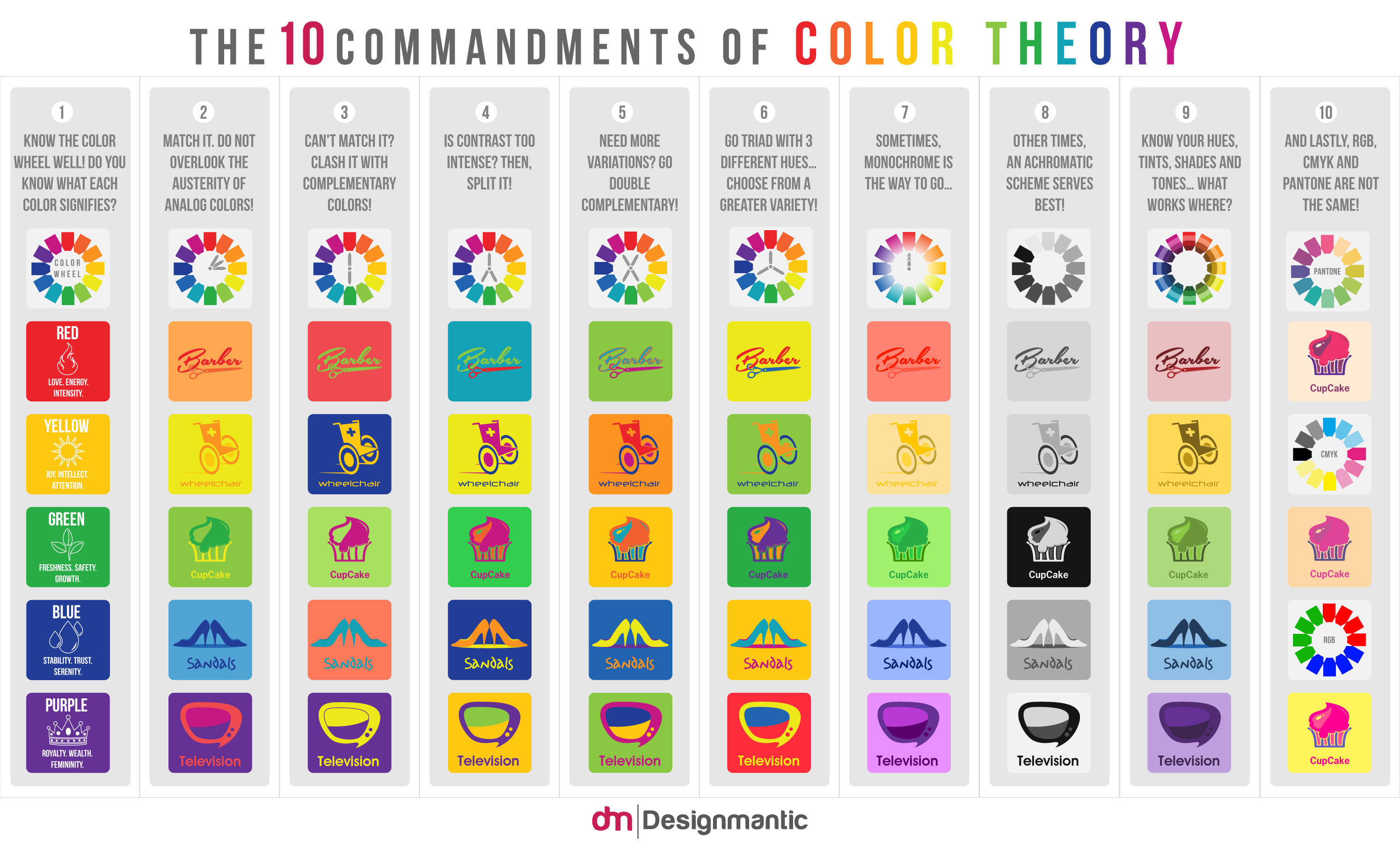 This infographic does a great job of showcasing different color types for use in graphic elements or logos and even some font but I think it is important to offer a huge bit of advice: be careful going too crazy with color with your font. Above all else you want your information to be readable, using a red background and green font may be contrasting yes, but when the font is size 12 and both colors are bright, all it does is make eyes bleed and no one can properly get the information they need from the banner.
[caption id="attachment_23235" align="aligncenter" width="450"]
This infographic does a great job of showcasing different color types for use in graphic elements or logos and even some font but I think it is important to offer a huge bit of advice: be careful going too crazy with color with your font. Above all else you want your information to be readable, using a red background and green font may be contrasting yes, but when the font is size 12 and both colors are bright, all it does is make eyes bleed and no one can properly get the information they need from the banner.
[caption id="attachment_23235" align="aligncenter" width="450"] Better one? Or better two? Definitely one.[/caption]
So in this part we've gone over the importance of typography and color with regard to event design. Above all else, you want your event to pop, to make people see it and want to know more and capture their interest. That is what good design is about. By ensuring your banners and event pages are designed well, you'll be able to capture more interest from your audience.
Now, you should have an idea of how to pair your fonts to your type of event and how to pair them together. Additionally, you're probably awesome at color pairing and making your banner grab a viewers interest. If you're looking for more information on design, check out the links in this post and make sure to subscribe to our blog for the next part!]]]]> ]]>
Better one? Or better two? Definitely one.[/caption]
So in this part we've gone over the importance of typography and color with regard to event design. Above all else, you want your event to pop, to make people see it and want to know more and capture their interest. That is what good design is about. By ensuring your banners and event pages are designed well, you'll be able to capture more interest from your audience.
Now, you should have an idea of how to pair your fonts to your type of event and how to pair them together. Additionally, you're probably awesome at color pairing and making your banner grab a viewers interest. If you're looking for more information on design, check out the links in this post and make sure to subscribe to our blog for the next part!]]]]> ]]>