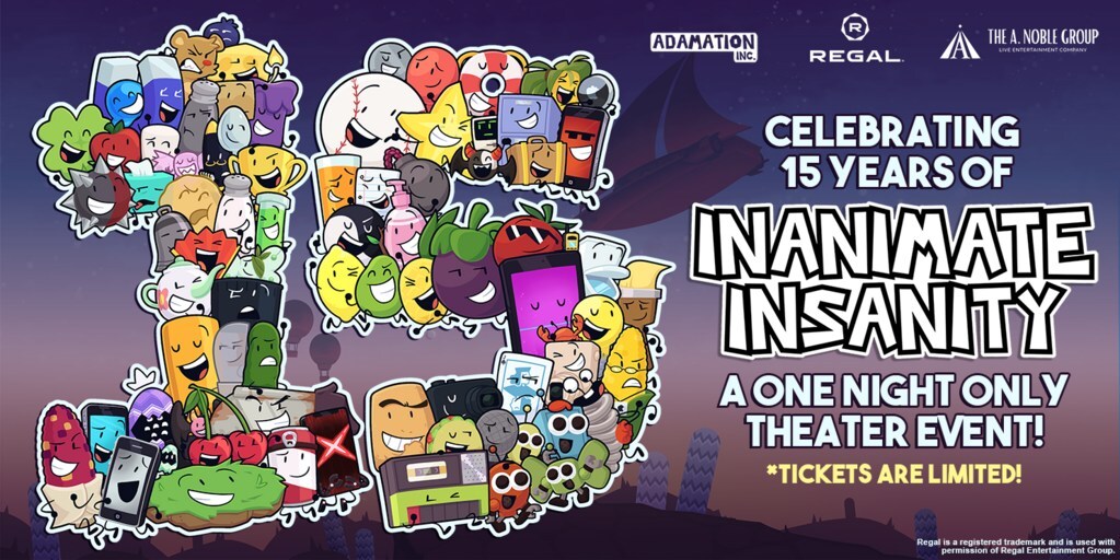
Create a Custom Event Page Banner
Your event page banner image is the first impression people have of your event. So, Ticketbud has put together a event page banner design starter kit. Using Canva, you can create an event page banner that sets the tone for your upcoming event.
To get started, sign-up for Canva, a free online design tool. All you need is an email and a password to start creating on the site.
Once registered, use Ticketbud’s event page banner template to begin designing your banner within the proper size specifications (1024 x 512 pixels) for your Ticketbud site. The design toolbar to the left of your template hosts a range of options to add images, graphics, and text.
Need inspiration? Keep scrolling through Ticketbud’s design starter kit for eye-catching templates. Or, explore Canva’s templates by searching through the “Design” tab in the top left of the toolbar. Once selected, elements within template designs can be easily transformed to suit your event branding needs.

Upload Your Image
Aligning your event branding across platforms will help build recognition of your event. If you have a design or image you are using for your event, we recommend repurposing on your Ticketbud page.
To add your own image to the banner template, click “Uploads” in the left-hand toolbar and select the image from your computer files. This will add the image to your “Uploads” collection within the toolbar. From here, you can drag and drop it on the event page banner template.

Once you add the image to your design, pull on the corners and edges to fit it to scale. Be sure your adjustments don’t harm the integrity of the image by cropping off letters or distorting images.
Add Text

Beyond branding, your banner offers the opportunity to communicate important details about your event. To add information, such as registration deadlines or headliner details, select “Text” from the toolbar and “Add a text box.”
Once inserted, click the text box to edit the copy. And use the top menu to change the font, color and style.
Adding Details & Graphics
Under “Elements,” you can search and add specific shapes and images to your design. Options range from simple lines to videos. For now, avoid adding any audio or video elements to your event page banner design, as the space only supports image files.


I mean lets all agree this isn't the look you should go for.[/caption]
Some of these fonts look good. Some even begin to look good together, but all of them? All at once? Yeah its a mess. But how do you pair font for visual interest when you're not really sure of things like alignment and kerning and you've got like ten minutes to spare to create a fantastic flyer? Easy, stick with a font that offers multiple weights and variations. It is much easier to pair fonts that you know already go together.
[caption id="attachment_23233" align="aligncenter" width="450"]
We look classy! Using Avenir black + Avenir light[/caption]
I used Avenir, a font that comes with multiple weights with an option for oblique (that's italicized). Because they are the same font you won't have to worry about combatting different styles and making them mesh and it works well to create interest. Super easy.
If you have a bit more time and are feeling a bit more adventurous and really want to create some difference in text, look for font pairings that have a contrast but similar tone. Like up above, you wouldn't pair the font for "and really" with the serif of "fonts" those do contrast, yes, but the tone is different. One is highly stylized and messy and the other is very clear and classic.
[caption id="attachment_23234" align="aligncenter" width="450"]
After writing a word over and over enough times, it really doesn't look like a word anymore.[/caption]
These are all very different fonts but each font within each word does go together. Varying your weights is a great way to cause interest, as we've said, but so does mixing up some serifs and sans serifs, handwritten script and bold sans serif. And, in the bottom two we get to also play with all lower case vs all upper case, another great way to provide interest and difference without going too crazy with size difference.
There are a ton of resources for learning a bit more on typography as it is definitely an art. We want to provide just the basics to get you going but if you enjoyed this check out 
Better one? Or better two? Definitely one.[/caption]
So in this part we've gone over the importance of typography and color with regard to event design. Above all else, you want your event to pop, to make people see it and want to know more and capture their interest. That is what good design is about. By ensuring your banners and event pages are designed well, you'll be able to capture more interest from your audience.
Now, you should have an idea of how to pair your fonts to your type of event and how to pair them together. Additionally, you're probably awesome at color pairing and making your banner grab a viewers interest. If you're looking for more information on design, check out the links in this post and make sure to subscribe to our blog for the next part!]]]]> ]]>