Ticketbud Organizer – Elizabeth at Bridal Bliss
Hey you, welcome back to our design series! Or, welcome altogether if this is your first time. To check out our first article on event design go over here, it will provide some very basic ground work in color theory and typography which are useful before moving forward.
For this second part we’re picking apart image assets when in event design. Images are incredibly useful but if used poorly, can really give your event a negative look. Just follow these guidelines and it will keep your design from getting bogged down in image design hell.
Make sure you know the dimensions of your event page
This seems easy right? Wrong. I can not count the number of event pages that I have seen and edited that use incorrect image dimensions for their background event page and, even worse, for their header image. Using the correct image dimensions ensures that the image looks how it is supposed to and that you don’t have a banner with half of your information missing. How embarrassing.
Your best bet is just cropping it to fit. If you use an image editor like photoshop, you can set your crop dimensions to exactly the size you need and it will give you the correct size. Be careful attempting to just resize a picture as many times this can change the picture size ratio and make everything look wonky. Not the look you’re going for.
Please note: if your image is smaller than the required dimensions, uploading it anyways will make it look grainy and bad. Do not do this. Even if you think it will be ok.
Use images in social media, but know the dimensions!
Just like how using images on the event page itself is a useful way to add information and color and grab attention, doing it on social media will do the same thing. But again, be aware of social media size constraints! Unfortunately for everyone, there is not a standard social media image size. Facebook, Twitter and Instagram all have different sizes so it requires multiple images.
Not sure what sizes are on what platforms? No problem! Mainstreethost has a fantastic cheat sheet post on all social media image sizes that you may ever need. Here you can clearly see the different sizes needed for images on Twitter:  You probably won’t need most of these but it is important to know what the Twitter feed minimum is, what is recommended and what is displayed. Many times photos are cropped when displayed on timelines so you should be aware of what image size will actually be seen by people scrolling through their feed. They will not see your brilliantly designed full banner but rather just a small portion of it.
And for Facebook:
You probably won’t need most of these but it is important to know what the Twitter feed minimum is, what is recommended and what is displayed. Many times photos are cropped when displayed on timelines so you should be aware of what image size will actually be seen by people scrolling through their feed. They will not see your brilliantly designed full banner but rather just a small portion of it.
And for Facebook:
 Timeline photos and newsfeed photos are not displayed at the same dimensions because of course not. When in doubt of which sizes to go with, use the smaller size to ensure your image isn’t cut off. This also gives you a bit of extra info on what your Facebook profile photo size is which is also useful as we have a share image on our platform that conforms to the same dimensions as your profile photo.
If you’re looking to post your event design banner on any other platform, check out their blogpost for further image sizes for Pinterest or Instagram.
When using text with an image– don’t fight the image.
Let’s say you’re trying to use an image you took of your recent wine dinner as the background of your next wine dinner banner and want to add some text. Don’t fit the image. Don’t try to stick text over areas that have a lot going on, it will only make your picture look cluttered and text hard to read. Use the empty spaces where you can or create empty spaces by fading out part of an image to a single background color or use a textbox to make the text stand out. Yes, textbox does sound very Microsoft Powerpoint but it can be done to great effect, see how we did it here for one of our banners?
Timeline photos and newsfeed photos are not displayed at the same dimensions because of course not. When in doubt of which sizes to go with, use the smaller size to ensure your image isn’t cut off. This also gives you a bit of extra info on what your Facebook profile photo size is which is also useful as we have a share image on our platform that conforms to the same dimensions as your profile photo.
If you’re looking to post your event design banner on any other platform, check out their blogpost for further image sizes for Pinterest or Instagram.
When using text with an image– don’t fight the image.
Let’s say you’re trying to use an image you took of your recent wine dinner as the background of your next wine dinner banner and want to add some text. Don’t fit the image. Don’t try to stick text over areas that have a lot going on, it will only make your picture look cluttered and text hard to read. Use the empty spaces where you can or create empty spaces by fading out part of an image to a single background color or use a textbox to make the text stand out. Yes, textbox does sound very Microsoft Powerpoint but it can be done to great effect, see how we did it here for one of our banners?
 We’ve used our favorite pink color here to make a box that we can put the text over and have it pop and be legible. We’ve also turned the opacity so some of the image can still be seen. Without the box, our text, even as bold as it is, would be lost within the multiple elements of the photo.
Keep your sizes down!
Images file sizes can be huge and majorly slow down load times. You don’t want to do that when you want people buying tickets to your event! If you have a small image, you should be fine but if you have larger, full sizes images, or ones with a lot of layers and components, make sure to compress your image down before you upload it. Photoshop can do this when you save to web with PNG file format.
If your file size is still too large, or you haven’t been using Photoshop, no worries.
We’ve used our favorite pink color here to make a box that we can put the text over and have it pop and be legible. We’ve also turned the opacity so some of the image can still be seen. Without the box, our text, even as bold as it is, would be lost within the multiple elements of the photo.
Keep your sizes down!
Images file sizes can be huge and majorly slow down load times. You don’t want to do that when you want people buying tickets to your event! If you have a small image, you should be fine but if you have larger, full sizes images, or ones with a lot of layers and components, make sure to compress your image down before you upload it. Photoshop can do this when you save to web with PNG file format.
If your file size is still too large, or you haven’t been using Photoshop, no worries.
 Compressor.io is an incredibly handy website that will compress and shrink any image file down without losing quality. You will still have an amazing looking event design banner but without the slowed down load speeds that come when it is almost a MB in size.
So there you have it, a quick crash course in design and use of images for event pages. The most important thing is that you don’t fight your images. You want to use them and showcase them and make sure that any crops, textboxes and overlays you use all work with your image. Also be sure to check out the links in this post for more information or head back to our first design post to get a refresher on color and text.]]]]> ]]>
Compressor.io is an incredibly handy website that will compress and shrink any image file down without losing quality. You will still have an amazing looking event design banner but without the slowed down load speeds that come when it is almost a MB in size.
So there you have it, a quick crash course in design and use of images for event pages. The most important thing is that you don’t fight your images. You want to use them and showcase them and make sure that any crops, textboxes and overlays you use all work with your image. Also be sure to check out the links in this post for more information or head back to our first design post to get a refresher on color and text.]]]]> ]]>
cheap than you are dead in the water.
“But I’m a marketing person! I’m not a designer!” I can hear quite a few of you saying through the tinny speakers on my laptop. That’s okay, I’m not technically a designer either, I just play one on the Internet.
Basic design principles are universal and fairly easy to understand. No one is saying that you, the event promoter, need to be able to deliver a graphically designed band poster that fulfills all 6 basic design guidelines. You’re busy enough as it is, no need to throw that on your plate as well. What you should be able to do, however, is follow along with these major tips to make sure that your event poster, event page layout and everything else you have that will be customer-facing is designed well to entice the customer. Don’t worry, I made sure to keep the tips short and sweet. Let’s get to it!
1. Make sure your font choice is unique, legible and not Papyrus.
[caption id="" align="alignright" width="113" class=" "] Do not use this guy.[/caption]
Font choice is perhaps one of the hardest things to do when designing an event page and digital flyer. There are so many font choices out there it can be hard to narrow it down to what you want but it is important that you take the time to do so.
While some larger corporations may have a set standard group of fonts that must be used across all mediums for the company, many others allow for freedom when it comes to flyer design and that is when you need to take the time to check out your options.
You want your font to reflect the event you have going on.
To pick through your fonts it is good to understand the four main types of fonts: sans serif, serif, decorative and script. Piktochart has a great graphic for understanding how these font types look:
[caption id="attachment_23224" align="aligncenter" width="247" class=" "]
Do not use this guy.[/caption]
Font choice is perhaps one of the hardest things to do when designing an event page and digital flyer. There are so many font choices out there it can be hard to narrow it down to what you want but it is important that you take the time to do so.
While some larger corporations may have a set standard group of fonts that must be used across all mediums for the company, many others allow for freedom when it comes to flyer design and that is when you need to take the time to check out your options.
You want your font to reflect the event you have going on.
To pick through your fonts it is good to understand the four main types of fonts: sans serif, serif, decorative and script. Piktochart has a great graphic for understanding how these font types look:
[caption id="attachment_23224" align="aligncenter" width="247" class=" "] credit: piktochart [/caption]
[caption id="attachment_23223" align="aligncenter" width="250" class=" "]
credit: piktochart [/caption]
[caption id="attachment_23223" align="aligncenter" width="250" class=" "] credit: piktochart[/caption]
There are obviously a lot more sub-types under these four but these are the main groups. Do you have a real relaxed and fun event? Than a sans serif may be the best option for you. Have a wine tasting party? You may be able to go more towards a decorative or script font, depending on the location. Again, the type of event you have should be paired within the font and do not use Papyrus. No event matches Papyrus.
Not sure where to go to pick a font? There are a lot of places that have great fonts for cheap prices or for free (as long as it is a non-commercial use) and Canva has a lot of fonts already built in to their picture building app. So don’t worry, you’ll totally be able to find great fonts no matter where you’re making your designs.
Do not use multiple fonts willy-nilly
You may think that using multiple fonts makes your banner interesting and unique and looks fun but using too many fonts makes a design look unfocused, messy and cheap. No one wants their event to look cheap. You may be hosting a free block party but that doesn’t matter, you want it to look like a million bucks.
[caption id="attachment_23232" align="aligncenter" width="450"]
credit: piktochart[/caption]
There are obviously a lot more sub-types under these four but these are the main groups. Do you have a real relaxed and fun event? Than a sans serif may be the best option for you. Have a wine tasting party? You may be able to go more towards a decorative or script font, depending on the location. Again, the type of event you have should be paired within the font and do not use Papyrus. No event matches Papyrus.
Not sure where to go to pick a font? There are a lot of places that have great fonts for cheap prices or for free (as long as it is a non-commercial use) and Canva has a lot of fonts already built in to their picture building app. So don’t worry, you’ll totally be able to find great fonts no matter where you’re making your designs.
Do not use multiple fonts willy-nilly
You may think that using multiple fonts makes your banner interesting and unique and looks fun but using too many fonts makes a design look unfocused, messy and cheap. No one wants their event to look cheap. You may be hosting a free block party but that doesn’t matter, you want it to look like a million bucks.
[caption id="attachment_23232" align="aligncenter" width="450"] I mean lets all agree this isn’t the look you should go for.[/caption]
Some of these fonts look good. Some even begin to look good together, but all of them? All at once? Yeah its a mess. But how do you pair font for visual interest when you’re not really sure of things like alignment and kerning and you’ve got like ten minutes to spare to create a fantastic flyer? Easy, stick with a font that offers multiple weights and variations. It is much easier to pair fonts that you know already go together.
[caption id="attachment_23233" align="aligncenter" width="450"]
I mean lets all agree this isn’t the look you should go for.[/caption]
Some of these fonts look good. Some even begin to look good together, but all of them? All at once? Yeah its a mess. But how do you pair font for visual interest when you’re not really sure of things like alignment and kerning and you’ve got like ten minutes to spare to create a fantastic flyer? Easy, stick with a font that offers multiple weights and variations. It is much easier to pair fonts that you know already go together.
[caption id="attachment_23233" align="aligncenter" width="450"] We look classy! Using Avenir black + Avenir light[/caption]
I used Avenir, a font that comes with multiple weights with an option for oblique (that’s italicized). Because they are the same font you won’t have to worry about combatting different styles and making them mesh and it works well to create interest. Super easy.
If you have a bit more time and are feeling a bit more adventurous and really want to create some difference in text, look for font pairings that have a contrast but similar tone. Like up above, you wouldn’t pair the font for “and really” with the serif of “fonts” those do contrast, yes, but the tone is different. One is highly stylized and messy and the other is very clear and classic.
[caption id="attachment_23234" align="aligncenter" width="450"]
We look classy! Using Avenir black + Avenir light[/caption]
I used Avenir, a font that comes with multiple weights with an option for oblique (that’s italicized). Because they are the same font you won’t have to worry about combatting different styles and making them mesh and it works well to create interest. Super easy.
If you have a bit more time and are feeling a bit more adventurous and really want to create some difference in text, look for font pairings that have a contrast but similar tone. Like up above, you wouldn’t pair the font for “and really” with the serif of “fonts” those do contrast, yes, but the tone is different. One is highly stylized and messy and the other is very clear and classic.
[caption id="attachment_23234" align="aligncenter" width="450"] After writing a word over and over enough times, it really doesn’t look like a word anymore.[/caption]
These are all very different fonts but each font within each word does go together. Varying your weights is a great way to cause interest, as we’ve said, but so does mixing up some serifs and sans serifs, handwritten script and bold sans serif. And, in the bottom two we get to also play with all lower case vs all upper case, another great way to provide interest and difference without going too crazy with size difference.
There are a ton of resources for learning a bit more on typography as it is definitely an art. We want to provide just the basics to get you going but if you enjoyed this check out Envato tuts+ deep dive into font pairings or Canva’s design school.
2. Make sure your colors go together. Do not make eyes bleed.
So you’ve got your typography down, now to move on to colors. Picking the right colors are important as you want to create interest (there’s that word again) without making someone’s eyes bleed. If you’re making an event for an organization, you probably already have your color palette picked out for you by using the company’s colors (notice the very bright pink that has been used throughout this post?) but that’s fine. Most companies higher design teams to come up with their color standards so you’re good, you know your colors should complement and go well together so you can skip down to where we talk about how to use them together.
If, however, the hex palette is your oyster and you can pick any color you want, it is good to have some idea on color rules, like the one about not making eyes bleed. Each color signifies different things, red is vibrant and sexy and bold and blue is calming and serene and black is luxirious and expensive, etc. So before you go randomly picking any color at will just because it looks pretty (no shame, this is totally a strategy I have often employed) take some time to think about what kind of look you want and what tone you want to set.
Once you’ve decided on a main color, head over to Adobe Color. You pick your color and it will generate what other colors will complement it, contrast it and what palettes will work the best for you. It makes the guess work out of what colors can you use together so much easier.
If you want your look to be very relaxing, monochromatic palettes are nice. None of the colors jar and everything flows together. If you’re looking for colors to create a bit more visual interest, but not too much, check out complimentary colors on the wheel, they pop but not too much. Then of course there are contrasting colors which will offer you the largest visual distinction. They jar but in a good way but should be used sparingly, again, bleeding eyes, remember. Too much contrasting colors can create discord which is not what we want when promoting an event.
For a good breakdown on how these look check out this infographic from DesignMantic on the 10 color theory commandments:
After writing a word over and over enough times, it really doesn’t look like a word anymore.[/caption]
These are all very different fonts but each font within each word does go together. Varying your weights is a great way to cause interest, as we’ve said, but so does mixing up some serifs and sans serifs, handwritten script and bold sans serif. And, in the bottom two we get to also play with all lower case vs all upper case, another great way to provide interest and difference without going too crazy with size difference.
There are a ton of resources for learning a bit more on typography as it is definitely an art. We want to provide just the basics to get you going but if you enjoyed this check out Envato tuts+ deep dive into font pairings or Canva’s design school.
2. Make sure your colors go together. Do not make eyes bleed.
So you’ve got your typography down, now to move on to colors. Picking the right colors are important as you want to create interest (there’s that word again) without making someone’s eyes bleed. If you’re making an event for an organization, you probably already have your color palette picked out for you by using the company’s colors (notice the very bright pink that has been used throughout this post?) but that’s fine. Most companies higher design teams to come up with their color standards so you’re good, you know your colors should complement and go well together so you can skip down to where we talk about how to use them together.
If, however, the hex palette is your oyster and you can pick any color you want, it is good to have some idea on color rules, like the one about not making eyes bleed. Each color signifies different things, red is vibrant and sexy and bold and blue is calming and serene and black is luxirious and expensive, etc. So before you go randomly picking any color at will just because it looks pretty (no shame, this is totally a strategy I have often employed) take some time to think about what kind of look you want and what tone you want to set.
Once you’ve decided on a main color, head over to Adobe Color. You pick your color and it will generate what other colors will complement it, contrast it and what palettes will work the best for you. It makes the guess work out of what colors can you use together so much easier.
If you want your look to be very relaxing, monochromatic palettes are nice. None of the colors jar and everything flows together. If you’re looking for colors to create a bit more visual interest, but not too much, check out complimentary colors on the wheel, they pop but not too much. Then of course there are contrasting colors which will offer you the largest visual distinction. They jar but in a good way but should be used sparingly, again, bleeding eyes, remember. Too much contrasting colors can create discord which is not what we want when promoting an event.
For a good breakdown on how these look check out this infographic from DesignMantic on the 10 color theory commandments: 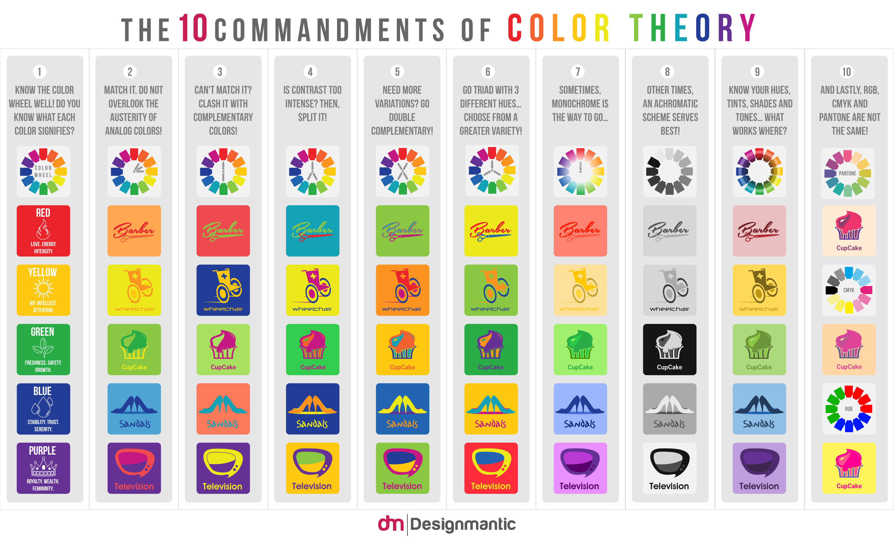 This infographic does a great job of showcasing different color types for use in graphic elements or logos and even some font but I think it is important to offer a huge bit of advice: be careful going too crazy with color with your font. Above all else you want your information to be readable, using a red background and green font may be contrasting yes, but when the font is size 12 and both colors are bright, all it does is make eyes bleed and no one can properly get the information they need from the banner.
[caption id="attachment_23235" align="aligncenter" width="450"]
This infographic does a great job of showcasing different color types for use in graphic elements or logos and even some font but I think it is important to offer a huge bit of advice: be careful going too crazy with color with your font. Above all else you want your information to be readable, using a red background and green font may be contrasting yes, but when the font is size 12 and both colors are bright, all it does is make eyes bleed and no one can properly get the information they need from the banner.
[caption id="attachment_23235" align="aligncenter" width="450"] Better one? Or better two? Definitely one.[/caption]
So in this part we’ve gone over the importance of typography and color with regard to event design. Above all else, you want your event to pop, to make people see it and want to know more and capture their interest. That is what good design is about. By ensuring your banners and event pages are designed well, you’ll be able to capture more interest from your audience.
Now, you should have an idea of how to pair your fonts to your type of event and how to pair them together. Additionally, you’re probably awesome at color pairing and making your banner grab a viewers interest. If you’re looking for more information on design, check out the links in this post and make sure to subscribe to our blog for the next part!]]]]> ]]>
Better one? Or better two? Definitely one.[/caption]
So in this part we’ve gone over the importance of typography and color with regard to event design. Above all else, you want your event to pop, to make people see it and want to know more and capture their interest. That is what good design is about. By ensuring your banners and event pages are designed well, you’ll be able to capture more interest from your audience.
Now, you should have an idea of how to pair your fonts to your type of event and how to pair them together. Additionally, you’re probably awesome at color pairing and making your banner grab a viewers interest. If you’re looking for more information on design, check out the links in this post and make sure to subscribe to our blog for the next part!]]]]> ]]>
1.Never Stops Learning Did you know that most people only read one book a year, and that this number is declining? Talk with most people, and they’ll tell you that after they graduated from college or they received their event planning certification that they’re done with learning. To be successful, you need to keep advancing your knowledge. And this isn’t just about reading books, it’s also about getting experience and practical tips to know how to run a successful event. So whether it’s reading blogs of other event planners, buying books on event marketing, or helping out your friend with her bridal shower, you need to keep honing your skill set. If you don’t, you can and will fall behind. 2.Works Well With Others You might be the only event planner for the event, but that doesn’t grant you omnipotence. For most events you’re also going to have to work with caterers, speakers, ticketing, vendors, and a lot more. Even the most basic events will require you to coordinate with others. A valuable tip, and also the Golden Rule: “people treat you how you treat them”. 3.Uses Technology (When Appropriate) There’s a whole slew of event technology nowadays, so much it seems overdone. There’s iBeacon, RFID, conference apps, event management software, and so much more. To make matters worse, some blogs seem to say that if there aren’t drones flying overhead snapping photos for your instagram and pinterest blogs then you might as well just pack it in. Here’s the only litmus test I have for event technology is this: does it make something more fluid? Asked in another way: does it remove some sort of friction from the event and make it more enjoyable for attendees? For example, I find registration software to be helpful because it removes the chore of excel spreadsheets. Check-in apps and RFID are much cleaner than just checking names off a list and can notify you of VIPs. Conference apps, too, can help measure engagement. They can also help attendees schedule their days more efficiently. I say appropriate use of technology because you can’t be using technology just for the sake of using it. I’ve seen Tweet Walls used to great effect and I’ve also seen them gone unused because they’re in an inappropriate setting. 4.Asks for and Implements Critique Athletes have coaches, employees have managers, students have teachers. But when you’re an event planner, you’re normally in a situation where there is no critique or feedback towards what you are doing. To be successful at what you’re doing, you need to have someone – like a mentor – to help you improve. People have different personalities and different viewpoints that can make you even better at being an event planner and/or designer. After you receive critique or feedback, you should consider what you have learned. If it’s just negative and provides no learning experience, it’s best to ignore it. But if it’s something that critiques your event in such a way like “you need more ways for attendees to interact with the speaker” then it warrants further thought. 5. They Don’t “Go With the Flow” “I find out what will be trending and available to the public around the time of my event—and then I avoid it.” —Billy Butchkavitz One thing I’ve consistently noticed that most of the top event planners is that they are not beholden to the trends that are currently going on. This doesn’t mean that you shouldn’t use a popular trend if it works well for an event. It means that you do your best to make your event stand out from all the other events out there. The best way to make people care about what you’re doing is to have a unique proposition for your event. As the saying goes, the purple puppy is the one that stands out. 6.Wide Range of Knowledge (marketing) The best event planners are also bloggers and marketers. They are a “Renaissance man” or woman of the event space. Mindy Weiss, for example, knows how to market herself with a blog that talks about events she plans for (and has already designed and done). 7. They let their personality shine Building off of #5, one of the easiest ways to be successful is to let your personality and creativity shine through in every project you work on. In my experience, most people are too timid and afraid of opinions to achieve peak creativity. Even worse, people can be scared that their designs will put people off. Now here’s the thing: your style could put people off, but that’s okay. Are you curious to know why? It’s because some other people might find your design style to be whimsical or cutting edge or something else positive. I see articles about companies that love using certain designers because of the aesthetic they bring to the table. Some of these designers are now hailed as the best in the business. To conclude, I think that a lot of these habits are basic habits that happen to be tuned to an event planning mindset. The best thing about a lot of these habits is that while some of them may be tough to achieve, having them puts you a step above all your competition.]]]]> ]]>
Here’s a help article that gives an overview of your new reporting dashboard.
In addition to the dashboard, we’ve added new reporting layers that answer your data-driven questions. This includes a sales map that provides the exact location of where each purchase occurs. You can use the map to understand the ROI on your advertising campaigns in different geographic areas.
 As part of our continued progress towards building an organizational hub, we’ve added functionality for pulling data across all of your events. We talked about adding quick ticket search and have now added the ability to export your entire attendee list. Now with the click of a button, you’ll have access to your entire list of attendees.
 As always, let us know your thoughts on this new release. We build features based on your direct feedback so don’t be a stranger!]]]]> ]]>
Using Slack for Conferences
Your staff needs to be on the same page or else your conference will fall apart. Text messages and email chains are a struggle with large numbers. Good luck being productive while sifting through a never ending email thread. Phone calls work in some situations but usually waste precious planning time. Slack accomplishes what these forms of communication cannot. The app allows you to easily make channels within an organization. This enables volunteers, staff, PR, catering, or even the balloon animal team to streamline communication. No hassle, no missed messages. David Bisset details his experience using Slack to organize WordCamp Miami 2015. When Google Docs & smoke signals ended up not working, David turned to Slack and saw awesome results. Using private channels, WordCamp created sub-channels for different subjects. Sponsorships, speakers, and volunteers all had their own channel to avoid the messiness of a single, public chat.
[caption id="attachment_23173" align="aligncenter" width="396"] Communicate with your staff in real-time using groups or direct messaging.[/caption]
Right now I work with a large-scale event company that puts on a convention every year. Most of the team is based in Atlanta but me? No, I like to be a rebel and I’m in a completely different time zone. By using Slack, we stay on the same page with what we all need to be doing. Announcements and important dates never get missed. It enables me to be able to work seamlessly with a team that I am not in the same zip code with at all. If you’re next event has many working parts, Slack makes it so much easier to keep everyone on the same page.
Communicate with your staff in real-time using groups or direct messaging.[/caption]
Right now I work with a large-scale event company that puts on a convention every year. Most of the team is based in Atlanta but me? No, I like to be a rebel and I’m in a completely different time zone. By using Slack, we stay on the same page with what we all need to be doing. Announcements and important dates never get missed. It enables me to be able to work seamlessly with a team that I am not in the same zip code with at all. If you’re next event has many working parts, Slack makes it so much easier to keep everyone on the same page.
here , and the same concepts apply. People fall for flash sales all the time – we can’t help it, it’s human nature to desire something that is difficult to get. With all these benefits of Pop-Ups in mind, let’s look at 5 ways to ensure that your Pop-Up concept, whether it be a retail store or restaurant, is successful.
]]]]> ]]>
As you’ll recall in my last post, content marketing is essential for positioning yourself as a leader within your industry. It is also a fantastic way to get people more interested in going to your event or using your event planning business. With that being said, I wanted to talk a little bit about how to use blog posts to accomplish that. Guest Posts Guest posts can go one of two ways: either you have somebody post on your blog, or you make a post on somebody else’s blog. Somebody posting on your blog: If you’re going this route, the best thing to do is get somebody who is well respected in your industry or niche to post about a topic that relates to your event. This means that if you’re doing a trade show, having a representative from a company writea bout what to look for in a certain product is great. If it’s a comic convention, having a special guest write about something is sure to be a winner. If it’s a social event, even having somebody who regularly frequents it write about a great experience they had will be relatable. Posting on somebody else’s blog: Your first step is to identify blogs in your industry or nicheThe second is to identify if any of them allow guest posting. Stop right here – remember that you’re posting on somebody else’s blog. This means that you can’t just advertise your event your your service. You need to provide something of value before you can talk about yourself or you’re not going to be allowed to guest post. Or, worse, you’ll look self-serving and it will rub people the wrong way. Once you have a list of potential guest posting opportunities, email them all! Or if you know them in person, just ask. Be sure to make your email stand out. Pitch an idea or interesting perspective for a piece within the email. This is far more likely to be accepted than a vague “can I write a thing for you?”. Also, don’t forget to go big! Some blogs may seem intimidating because they’re huge within their field and have thousands of followers, but include them in your email pitch. If your idea is good, they’ll be interested! For Event Planning Businesses If you’re running an event planning business, you should have regular blog posts. Blog posts come in all shapes and sizes: you can write about things you’ve learned, tips and tricks for other event planners, embarrassing/funny stories about planning, and much more. The blog posts you write are only limited by your own imagination. There’s a story behind every event you’ve planned and the experiences you’ve gained from it. Some of the most popular event planning sites out there, like eventplanningblueprint.com , have an extremely robust content section. For Events If you’re making blog posts to market an event, you should post regularly but the content shouldn’t be about tips and tricks. It should be anticipatory in nature – perhaps post “leaked” pictures of what the event will look like. Guest posts from speakers and stars are great here. If you’re running a conference or trade show, talk about vendors or speakers that are going to be there. Just like with conventions, see if a speaker or a certain vendor is willing to write a short post about their experiences or anything else that relates to your convention. Other Tips – Have a schedule set up. People enjoy regular content and will make it part of that day’s routine. Communications studies have shown that many people would read a newspaper every day just because it was a habit. So whatever day you’re going to make a post, stick with it! – Keep paragraphs short. Imagine if I had no line breaks and everything I’d written so far was in one huge paragraph. It’d be an eyesore and mentally taxing to read. – Headers should be in bold. Did you notice that all my headers were in bold? Due to the effect of social media and Gawkeresque sites, people tend to skim articles and this can point them in the right direction. There are a lot of arguments on long posts vs. short posts and what works best. According to Medium, the optimum post length takes about an average of 7 minutes to read (post here). You also have Buffer saying an optimum post has about 1,600 words (post here).This allows for the post to contain enough information for the reader to find relevant without also taking up too much time or overwhelming them. That’s not to say short posts aren’t good or useful, as I think this one fits both criteria! I think a blend of both is the best way to go but, testing with your own audience and what they respond to is the best way. Conclusion I hope this gave you some inspiration to get started on a blog for your event or for your event planning business. If you’re interested in more posts about blogs, check out my post on how to use blogs to sell tickets online. ]]]]> ]]>
We’ve talked about all kinds of marketing for events on this blog, but one has been missing – until today.
Content Marketing is one of the most influential types of marketing out there and it comes in many shapes in sizes. From blog posts to how-to articles to videos to white papers, there isn’t a single event out there that couldn’t benefit from content marketing.
Today I’m going to talk about how events can use content marketing to help get new attendees to their events. Some of the most important types of content for events will be video, photo, news, and blog posts.
For this introductory part to the series, I want to talk about why content marketing is so powerful.
1. Content Marketing Will Make You Look Like Leader In Your Industry.
Let’s take two comic book conventions, A-Con and B-Con. A-Con (not to be confused with the rapper) has weekly emails detailing various happenings. B-Con also has weekly emails, but they also have blog posts detailing special guests like Harrison Ford and that one guy in the back of the cantina. Not just that, but B-Con also posts interviews from cosplayers and even has surveys asking attendees what they might like for next year.
So, which convention sounds like they’re at the top of their game? Which convention sounds like the one you’re going to want to go to? It’s not a trick question. It’s clear that that the convention putting out more content for their attendees is going to be the convention people flock to. Make no mistake, something as simple as a video can result in increased sales.
2. Content Marketing Will Make People Remember You More
Have you ever heard of Michelin Stars? A restaurant can be awarded from 1 to 3 stars, with 3 being coveted and tough to get. Most restaurants aren’t awarded Stars at all, so even being given a single Star can be a huge deal. If the name Michelin sounds familiar, that’s because it’s the Tire Company with the funny-looking mascot. While this might seem random, people now know the name Michelin across different industries. Your event’s name will stick in more people’s heads. Anecdotally, when first writing this article I was trying to think of examples and this is the first one I thought of simply because it was so interesting. And I just recently got a flat tire on my car and the first thought that popped into my head was to see about getting a set of Michelin tires.

3. People Come For the Content, Stay For The Brand
Watching a funny commercial or reading an in-depth white paper is something that most people are interested in. Hence, people will actually go out of their way to learn about a new topic or to watch the best Superbowl Commercials. But what happens when someone watches 10 wacky videos of a blender destroying iPhones, crayons, and Thanksgiving dinner? You start to consider purchasing that blender, even though you might have just started watching the videos for fun. Check out the two comments below:
[caption id="attachment_23038" align="alignnone" width="450"] You’ll notice, of course, that they bought it on eBay. However, its competitor lost a customer due to the Will It Blend? campaign.[/caption]
In 2007, spending precious time watching ads for products would be laughed at, but now it’s the norm. You can see just by those two photos that these videos which many (including myself) watched for fun ended up creating a huge profit for the company. And it has almost 900,000 subscribers on youtube – if even 1% of them purchased a blender for $400, that would be 9000 people buying a blender which is $3,600,000 in revenue.
4. Content Marketing Helps Identify What’s Important
When Jack, Megan or I start creating articles for the Ticketbud blog, we look over what we’ve done before and what’s been successful. We also take note of what might not have been as popular. Over time, we get better at what we’re doing and the blog posts we write now are, in my opinion, much better than blog posts we wrote even a year ago. Writing a lot of posts has helped us identify what readers coming to this blog like, and we now write better and more targeted posts because of that!
The other benefit is that as you write more, you become better at writing. As you record more videos or do more how-to’s, you become more competent at those tasks. Overall, creating content is not just good for getting more attendees, it’s good for your event as well.
Next week I’m going to start detailing the different ways to use Content Marketing for your event.
Next Week: I talk about Blogs
]]]]> ]]>best event registration software.
here. (more…)
